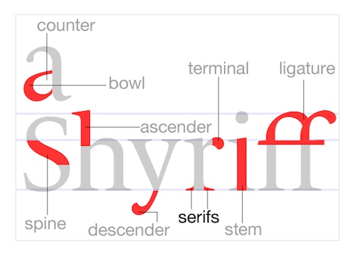
Here is a good blog post displaying common web fonts.
http://www.ampsoft.net/webdesign-l/WindowsMacFonts.html
Typography
8 Rules for Creating Effective Typography | Design Shack
8 Rules for Creating Effective Typography
- Learn the Basics
- Watch Your Kerning
- Be Aware of Font Communication
- Alignment
- Choose a Good Secondary Font
- Size Matters
- Use Typography As Art
- Find Good Inspiration
Here is a great article from the Design Shack that discusses both a hot trend and timeless art: typography.
via 8 Rules for Creating Effective Typography | Design Shack.
Stunning Typography Portraits
Lately, I have really been attracted to typographic portraits. It is really impressive how one can express their thoughts & mood by arranging type within shapes and images to create amazing works of art. Fuel Your Creativity has posted an article about Typography Portraits. http://www.fuelyourcreativity.com/15-stunning-typography-portraits/
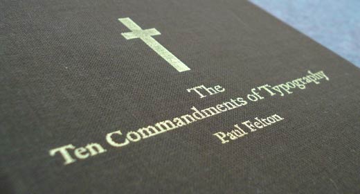
The Ten Commandments of Typography
‘Understand the rules before you break them.’ A mantra we become all too familiar with when studying typography. Something many of us found bothersome as it implied subjecting ourselves to a rigid framework—and what creative wants that? Then we learn the rules, realise that they actually do work and start to use them well. The rules make it easier to play the game. The Ten Commandments of Typography serves as a reminder of these safe, warm guides.
