When a moodboard is too vague and a comp is too literal.

I recently had the opportunity to attend the Charlotte User Experience Meetup Group. The evenings topic was titled “Death to Wireframes, Long Live Rapid Prototyping,” the speaker was Bermon Painter. Bermon is an amazing presenter, communicator, designer and individual. One of the resources mentioned as a rapid prototyping resource was Style Tiles.
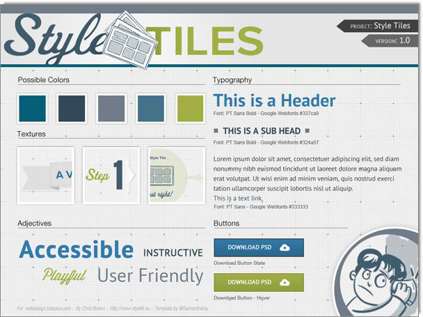
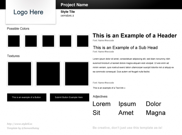
Style Tiles are a design deliverable consisting of fonts, colors and interface elements that communicate the essence of a visual brand for the web.
They help form a common visual language between the designers and the stakeholders and provide a catalyst for discussions around the preferences and goals of the client.
Style Tiles are similar to the paint chips and fabric swatches an interior designer gets approval on before designing a room. An interior designer doesn’t design three different rooms for a client at the first kick-off meeting, so why do Web designers design three different webpage mockups?
Style Tiles were created by Samantha Warren, a designer at Twitter.
